At Mariscos Apolo we have renewed ourselves: we have a new corporate identity, a new website, and new packaging!
With this change we want to update and unify our brand, creating a unique experience for each of our customers.
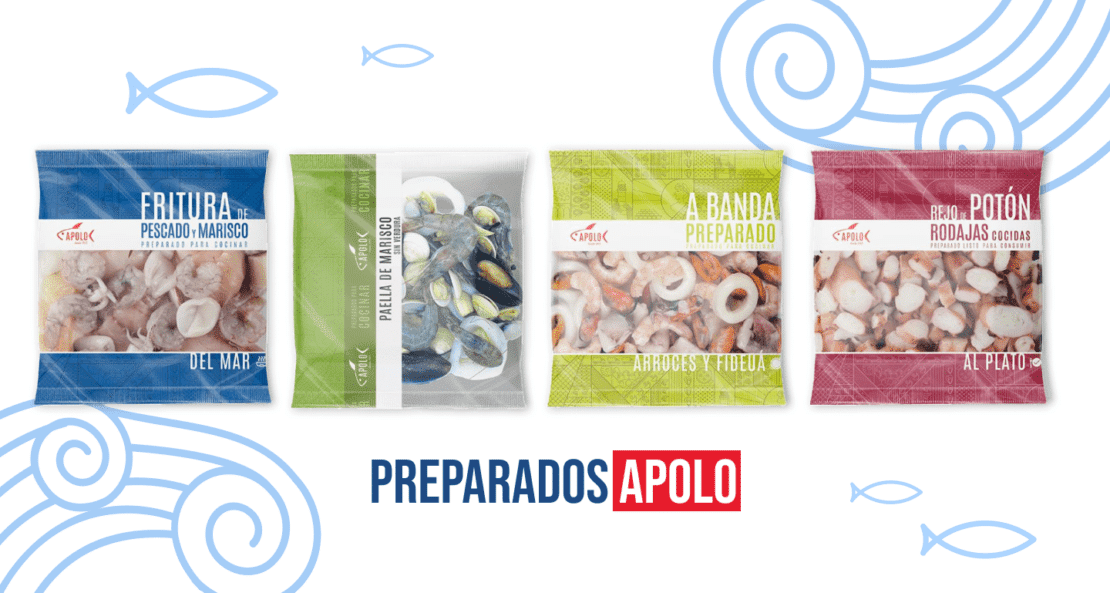
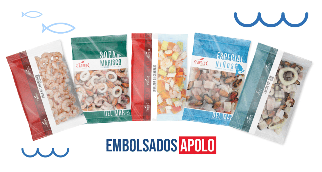
Attractive on the outside and rich on the inside
Packaging is the calling card of every product, and did you know that more than 70% of purchasing decisions are made at the point of sale? That is why it is so important that the packaging, in addition to the product, is appetizing.
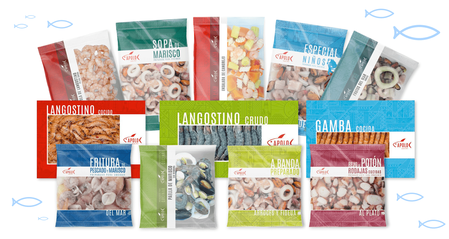
And in Mariscos Apolo we wanted to go for differentiation through color and a decorative pattern with a lot of history.
Among its main functions we can find:
- Protect and secure the product
- Facilitate distribution
- To provide information by communicating the characteristics of the product
- To serve as an impulse to buy and differentiate from the competition.
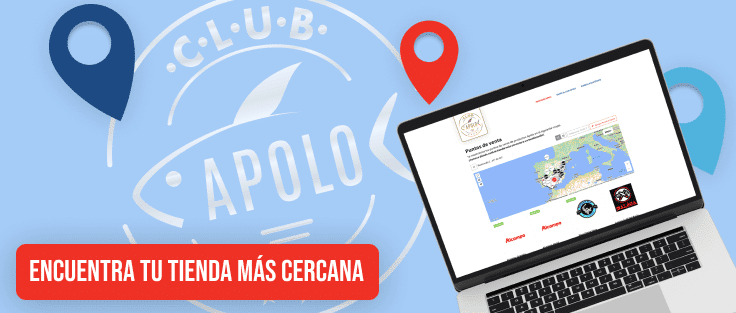
Its implementation on store shelves is being carried out gradually, so from now on you will be able to find it in your usual supermarket.
The design offers graphic representations that wink at its products, values, history and its founder, represented by the god Apollo, a god in love with the sea, the sound of its waves, its strength, depth and its species. Who with his nets thrown into the sea and together with the help of his fleet, captured the ???????????????????????????? ???????????????????????????????? ???? ???????????????????????????????? to make them reach the whole world so that they could enjoy the ???????????????????????? ???????? ????????????.
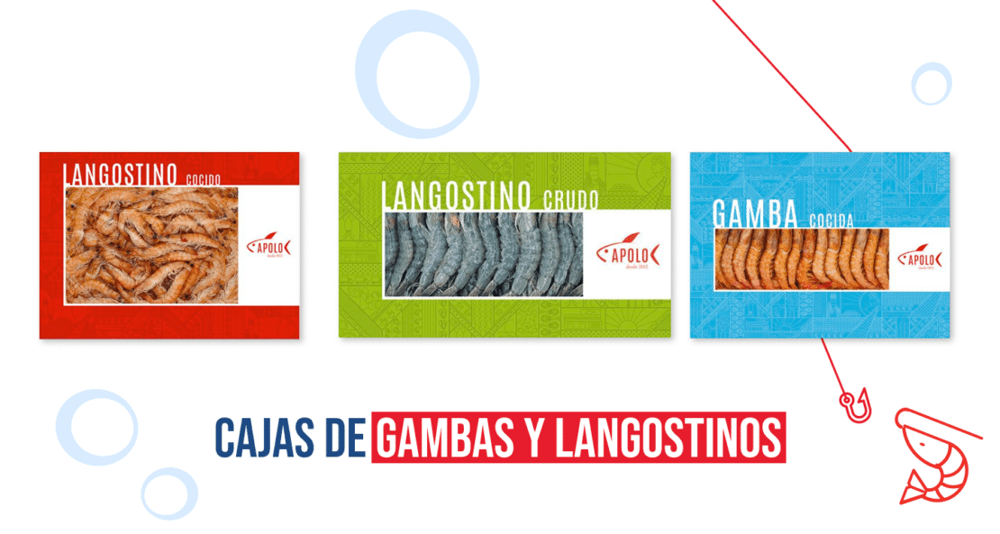
Full color
The Apollo red is complemented by secondary shades of blue, pink, green, lilac, black and gold that combine perfectly with each of the products they dress and make you match on the supermarket shelves.
This is just the beginning of our great story, we invite you to continue discovering it in each of our products.