TheApolo’s preparations new packaging. Its three current product ranges -preparedseafood, prepared seafood and paellas- reinvent the design of their packaging to highlight their personality and quality compared to other seafood products on supermarket shelves.
With this innovative image, the company from Granada, Andalusia’s leader in the frozen food sector, highlights the uniqueness of its products, which contain a combination of fish and seafood from the best fishing grounds in the world.
Aware of the importance of packaging as the main vehicle of communication with the consumer, Congelados Apolo takes a step forward with the launching of new and attractive packages that combine the functionality of the bagging as an element of protection and storage of the product with the necessary visual impact to prevent it from going unnoticed, thus underlining the quality of origin that identifies the brand.
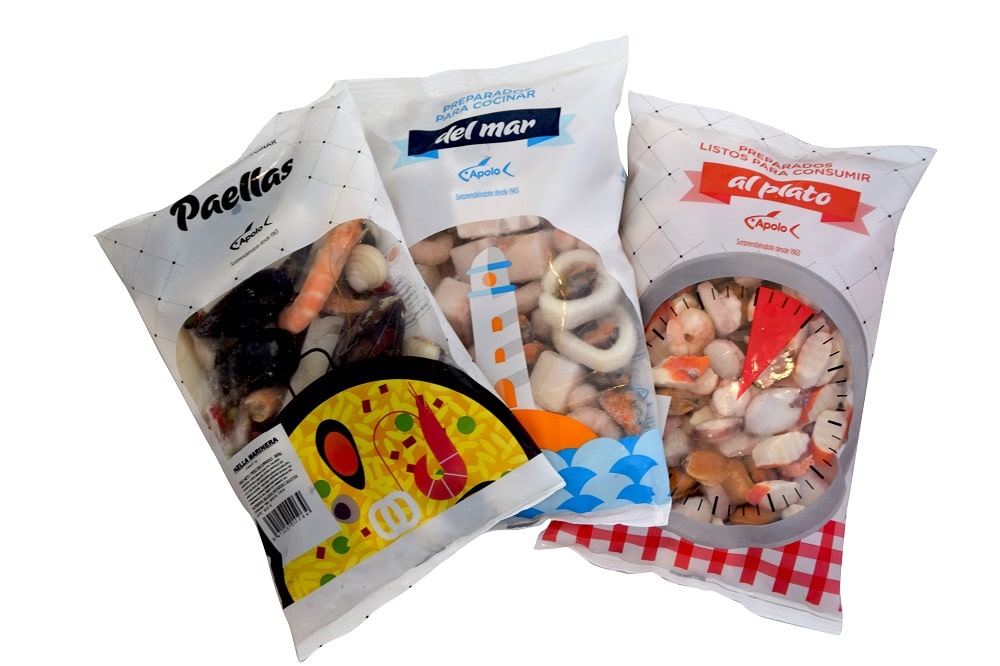
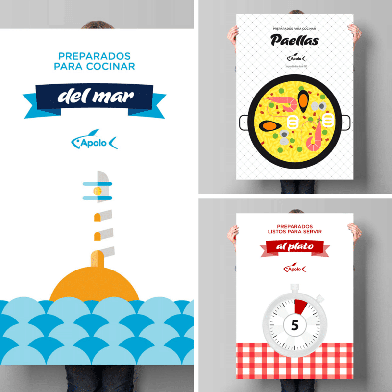
The new packaging is based on graphic elements to define each line: a bucolic lighthouse for the assortment of seafood preparations (seafood soups, fried fish and seafood, special seafood preparations for children…), the illustration of a paella in which some of its ingredients are highlighted, for the paella preparations (seafood, vegetable, select, gold series…), and a watch, in the case of the prepared dishes (crab salads, authentic octopus splashes, octopus cocktails…), thus focusing on the short time needed for their preparation: once defrosted, they are ready to serve just by dressing them.
These new graphic elements reinforce the attractiveness of the product by merging with a large transparent central window with a differentiated shape for each assortment – oval, square and round – that allows the contents to be viewed. In this way, the end consumer has two visual elements to distinguish the range in question.
In order to ensure that the public does not lose its visual references, the red and blue colors that historically identify Apollo’s ready-to-eat and Apollo’s sea preparations, respectively, have been retained.
The checkered cloth and the geometrical flake-shaped pattern have also been retained, in both cases to avoid a visual break with respect to the previous packaging.
Both ranges thus benefit from their long history in the frozen sections of supermarkets. With these motifs, the new design also adopts a very fashionable retro touch, with a nod to the tradition of a company which, since its foundation, has been committed to innovation and cutting-edge technology without forgetting the care of homemade products, where attention to every detail counts.
For the paella line, which no longer belongs to the seafood preparations and is emancipated with its own range as well as new varieties, we have sought a groundbreaking aesthetic with respect to the previous one, although with visual elements in congruence with the aesthetics of the preparations. The paella assortment displaces the field preparations, which the company has put aside to focus on the sea varieties.
In the three new bags, available in one kilo and 500 gram formats, white is used as a vehicle to accentuate the prominence of the product, which is completely visible to the consumer through its transparent front window.
This new graphic discourse further differentiates the preparations and the Apolo brand itself, “reinforcing its identity”, explains Ramón Soler García, creative director atRSC StudioThe company from Lojá has entrusted this internationally recognized studio, with which it has been working for more than 15 years, with the new design of its packaging.